• Home
  • About
  • Advertise

Smart Marketerz

Marketing And Smart Business Tips

  • Business
  • Make Money Online
  • Finance
  • Marketing
  • Blogging
  • Social Media
  • SEO
  • Web Traffic
  • Tech

Pensions Map Infographic: How Much is the UK Saving?

June 29, 2017 By admin

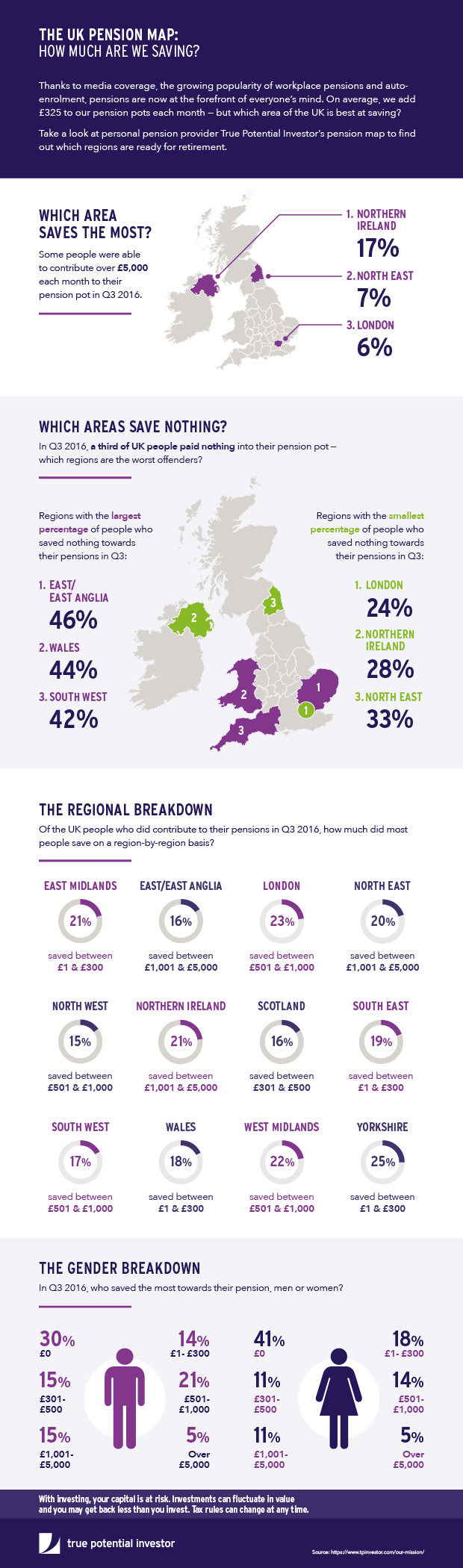
The UK media has been filled with headlines about pensions this year but how well are people really preparing for their retirement?

Financial services and technology organisation, True Potential, has put together the pension map infographic below.

Take 5 minutes to browse the piece for yourself and uncover which areas of the UK are saving the most towards their pension pots.

  • Facebook
  • Twitter
  • Google+

Filed Under: Business Tagged With: personal finance

Comments

  1. Asif says

    July 4, 2017 at 8:13 am

    Hi,

    That’s a great infographic, can you tell me How I can design the infographic? Basically, I am using Adobe Photoshop CC version, I have good knowledge about it, but do you another tool for design infographic please tell me.

    Thanks for shared.

SPONSORS

Don’t Miss to Read This

How to Be Smart in Online Forex Trading

How Can a Call Answering Service Benefit a Transport Company

Increase Sales And Website Hits Without Spending A Fortune

Why You Should Spend More Time Thinking About Your Online Presence

SEO Mistakes You Must Avoid

Recent Posts

  • 14 On-Page SEO Perfected Methods You Need to Use
  • Understanding the Benefits of UGMA Accounts for Families and Financial Planning
  • Starting Smart: Tips for Launching into White Label Link Building
  • Need Great Business Emails? Read This First
  • How to Evaluate an IPO Before Buying Shares

Archives

Search

Copyright © 2025 SmartMarketerz - Privacy & Disclosure Policy