Text overlays allow you to superimpose words over videos and photos on your website. Using a layering technique enables you to change the text easily and create a more three-dimensional look for your design.
According to Internet Live Stats, there are 1.79 billion websites, but the number changes constantly. If you want to stay current, you must be ready to customize your site to meet visitors’ needs. Text overlays give you the freedom to swap out language, inform customers of current sales and highlight new products.
You can overdo it with text overlays, though. You must consider where to use them and what type of background works best, plus other best practices. Here are some rules of thumb to help you properly utilize them on your website:
1. Color Overlay
If your brand has a particular color palette, you can give an overcast to any image you place on your page. Utilizing transparency, you can add a tinge of color and then overlay it with text in the matching color for a streamlined effect. The design method of color overlays can create different moods on your website.
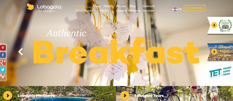 Lobagola lays a yellow overlay across the hero shot on their homepage. It gives the image a slight yellow cast while still allowing the photo’s different shades to peek through. They then use a text overlay in a vivid yellow with large typography, drawing the user’s eye and using a single word to drive home their message.
2. Call to Action (CTA) Overlays
You can utilize the method of text overlays for your calls to action. Make sure you keep the wording clear and to the point. The goal is to drive the user to move forward in the buyer’s journey. What language accomplishes that? An advantage of text CTA overlays is that you can easily swap out the words without changing your entire CSS coding.
3. Background Video
Videos offer a lot of information without many words. However, you might want to add a tagline, call to action or other wording to drive home a point. If you add the text to the video and later want to change the footage, you’ll waste a lot of time editing. However, using an overlay method allows you to superimpose text on top of any video you’d like to add to. You can also change the phrasing easily.

HO Penn Machinery streams a video in the background of their header. Customers see their machinery, their workers on the job site and shots of their equipment. As the video streams, different text slides in along with CTA buttons so people can learn more.
4. Text Positioning
In almost every photograph, there are areas of contrast. You might have a skyline in the center of the image. You never want to center your text there as it can look as though it is sitting on the horizon and get lost in the mix. Instead, look for an area with a solid color or blur your image slightly to give the visual effect of dark or light. Move your text to where it pops, even if it’s somewhat off-center.
5. Gradient Overlays
The recent design trends of flat elements are starting to be less popular. Gradients, however, seem to be taking hold in new and exciting ways. Websites utilize gradients in text overlays by giving colors unique splashes of hues as the shading ranges from dark to light. Some websites add the gradient to the background image and then lay text on top in a simple white.
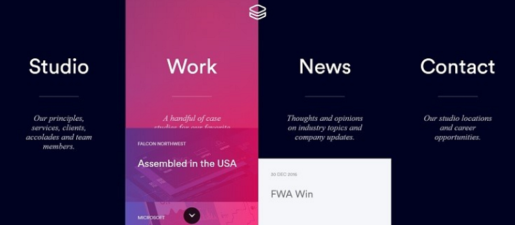
Impossible Bureau uses a gradient color overlay on their images as they pop up on hover. The interactivity of the page grabs user attention. They then layer the text on top of the gradient background. As you scroll over the section with the text, the color of the background overlay changes to dark mode, allowing the words to pop even more.
6. Big Text
The smaller the text you use, the more it will appear farther away from the user. Large text makes your words pop in a three-dimensional way. Think about the use of z-space and whether your overlays look as though they are blending into the background or coming to life.
7. Contrast and Brightness
When creating your text overlay, pay careful attention to where you place your text. Check if there is enough contrast with the background. You’ve likely seen websites where the overlay fades into the photograph and is almost unreadable. Most site visitors won’t work very hard to read the text. They’ll just skip forward or bounce to another website.
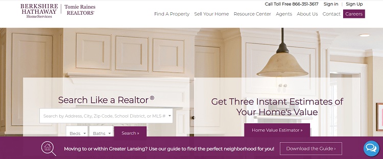
Tomie Raines Realtors uses a light and bright kitchen for their background image. The photo appeals to today’s homebuyers, but it could result in the text disappearing into the texture of the picture. They add a box with slight transparency behind the text to set it apart and add additional contrast.
Take a Step Back
Once you’ve created your text overlays, step back from the computer screen. Is it easy to read the words? Can you change the position, so the letters show up better? How are your contrast and focus? Moving away from the design and looking at it from a new angle helps give you ideas for elements to tweak. With a little extra effort, your text overlays will stand out from those of other websites.
About the Author
 Lexie is a web designer and IoT enthusiast. She enjoys hiking with her goldendoodle and checking out local flea markets. Visit her design blog, Design Roast, and connect with her on Twitter @lexieludesigner.